-
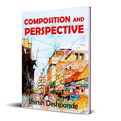
Composition and Perspective: A simple, yet powerful guide to draw stunning, expressive sketches
Regular price From $5.99USDRegular price -
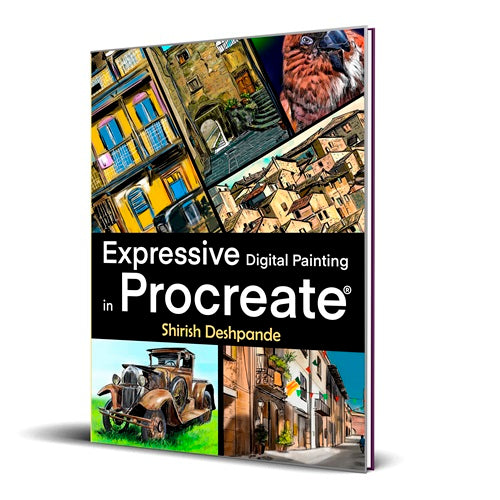
Expressive Digital Painting in Procreate: Learn to draw and paint stunningly beautiful, expressive illustrations on iPad
Regular price From $9.99USDRegular price -
Get-Set-Sketch!: Secrets of Pen & Ink Sketching Unleashed!
Regular price From $5.99USDRegular price$5.99USDSale price From $5.99USD -
Expressive Painting in Mixed Media: Learn to Paint Stunning Mixed-Media Paintings in 10 Step-by-Step Exercises
Regular price From $9.99USDRegular price$9.99USDSale price From $9.99USD
Bücher in deutscher Sprache
-
Ausdrucksstarke Digitale Malerei in Procreate: Lerne, atemberaubend schöne, ausdrucksstarke Illustrationen am iPad zu zeichnen und malen
Regular price From $9.99USDRegular price -
Get-Set-Sketch!: Geheimnisse des Skizzierens mit Stift und Tinte entfesselt
Regular price From $5.99USDRegular price$5.99USDSale price From $5.99USD -
Skizzieren mit Stift, Tinte und Aquarell 2 - Die Tempel von Kambodscha
Regular price From $9.99USDRegular price -
Stift, Tinte und Aquarell - 7 Ebooks-Bündel
Regular price $39.99USDRegular price$57.99USDSale price $39.99USDSale


Livres en langue française
-
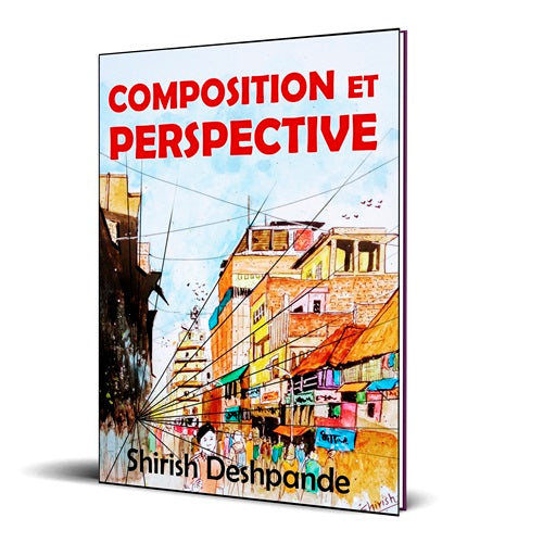
Composition et perspective: Un guide simple, mais puissant, pour dessiner des esquisses étonnantes et expressives
Regular price From $5.99USDRegular price -
Stylo, à l'encre et à l'aquarelle - Offre groupée de 6 livres électroniques
Regular price $39.99USDRegular price$56.99USDSale price $39.99USDSale -
Stylo, à l'encre et à l'aquarelle - Offre groupée de livres (Livre de poche)
Regular price $59.99USDRegular price$89.99USDSale price $59.99USDSale -
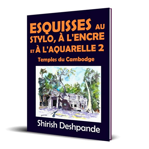
Esquisses au stylo, à l'encre et à l'aquarelle 2 – Temples du Cambodge
Regular price From $9.99USDRegular price

Libros en español
-
¡Preparate Para Bocetar!: Los secretos de los bocetos de bolígrafo y tinta se revelan
Regular price From $5.99USDRegular price$5.99USDSale price From $5.99USD -
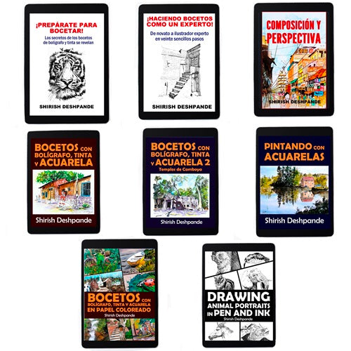
Bolígrafo, tinta y acuarela - 8 Paquete de libros electrónicos
Regular price $44.99USDRegular price$64.99USDSale price $44.99USDSale -
Dibujo retratos de animales con bolígrafo y tinta
Regular price From $9.99USDRegular price -
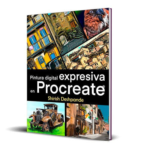
Pintura digital expresiva en Procreate: Aprende a dibujar y pintar ilustraciones asombrosamente hermosas y expresivas en un iPad
Regular price From $9.99USDRegular price